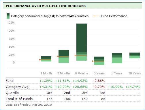
Performance Over Multiple Time Horizons
This section indicates how the fund performed over different time periods, both graphically and in chart form. The performance is represented graphically (performance over time) by 4 bars going from light green (bottom, 4th quartile) to the dark green (top, 1st quartile). A red line indicates the fund performance within the bar.
The chart presents fund performance as a percentage over the following time periods:
• 1 Month
• 3 Months
• 6 Months
• 3 Years
• 5 Years
• 10 Years
If the performance is positive, the number is green. If the performance is negative, the number is red.
The chart displays the following fund performance information:
• Fund: Displays the performance of the fund over time as a percentage.
• Category Average: Displays the Category average over time as a percentage.
• Quartile: Displays the quartile ranking of the fund.
• Total # of Funds: Displays the total number of funds in that category.
